YaSik
As part of my UI/UX Design research and practice I enrolled in a Specialization Course to help me develop more as a designer. In the course I was tasked with creating a website for a fictional restaurant. Part of the requirements for the course was to develop a concept, determine the target audience, create user personas, find user and client needs, design a sitemap, low fidelity/high fidelity wireframes and prototype the website. This is the final case study that I created for the project.


Final Prototype
This is a video of the final prototype in action, showing the uses of the app.

Brainstorming
The first steps for my process was to determine who the users would be. In order to do that I needed to create a variety of User Personas. I wanted to make sure that the User Personas that I created showed the different wants and needs of each user. Afterwards I determined the needs for both the user and the client and then created a simple site map to help guide the design process.


Site Map to help get an idea of flow of the Site.
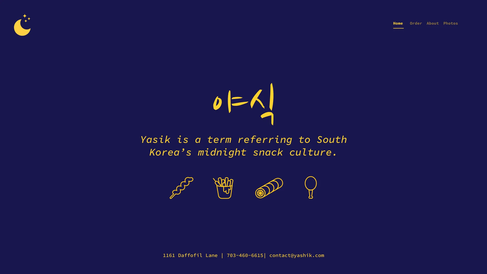
There were a few specific images that helped spark the Mood Board that I created. The largest sources of inspiration came from Neon Signs and the Nightlife of Korea. I felt that the glow of neon was a iconic look of Korean nightlife and I wanted to make sure that it came across in my design as well. As for the font, I wanted to utilize a hand drawn Korean font as well as a simple Serif font. I felt that the hand drawn Korean font was a common aesthetic that came throughout a lot the images that I searched through.

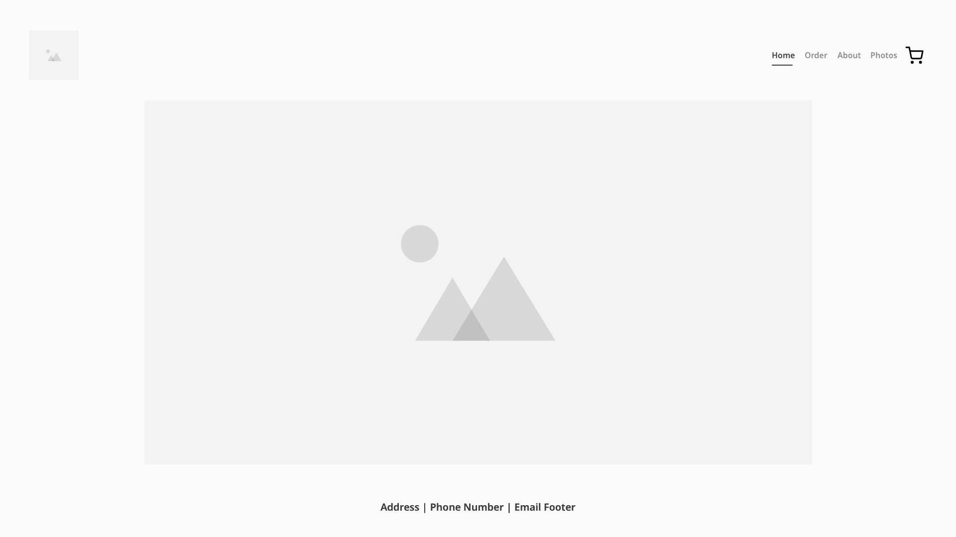
Low Fidelity Frames
After creating the User Personas, User/Client Needs, Site Map and Mood Board I went into Adobe XD to create the Low Fidelity Frames that would be used.
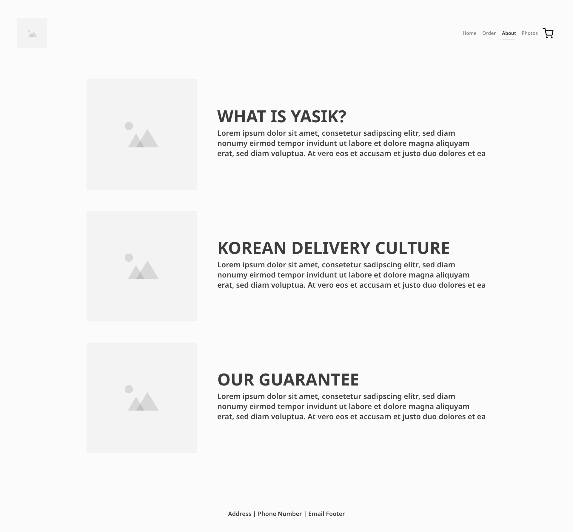
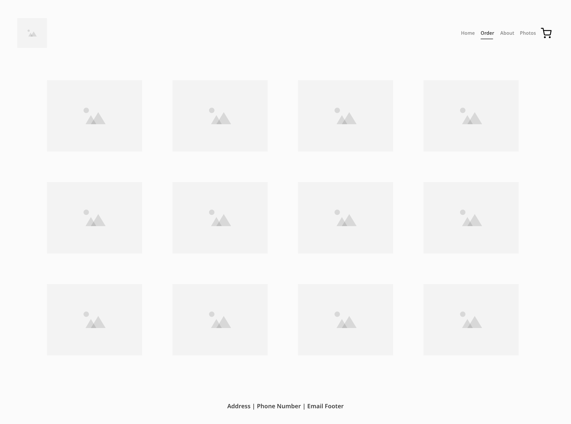
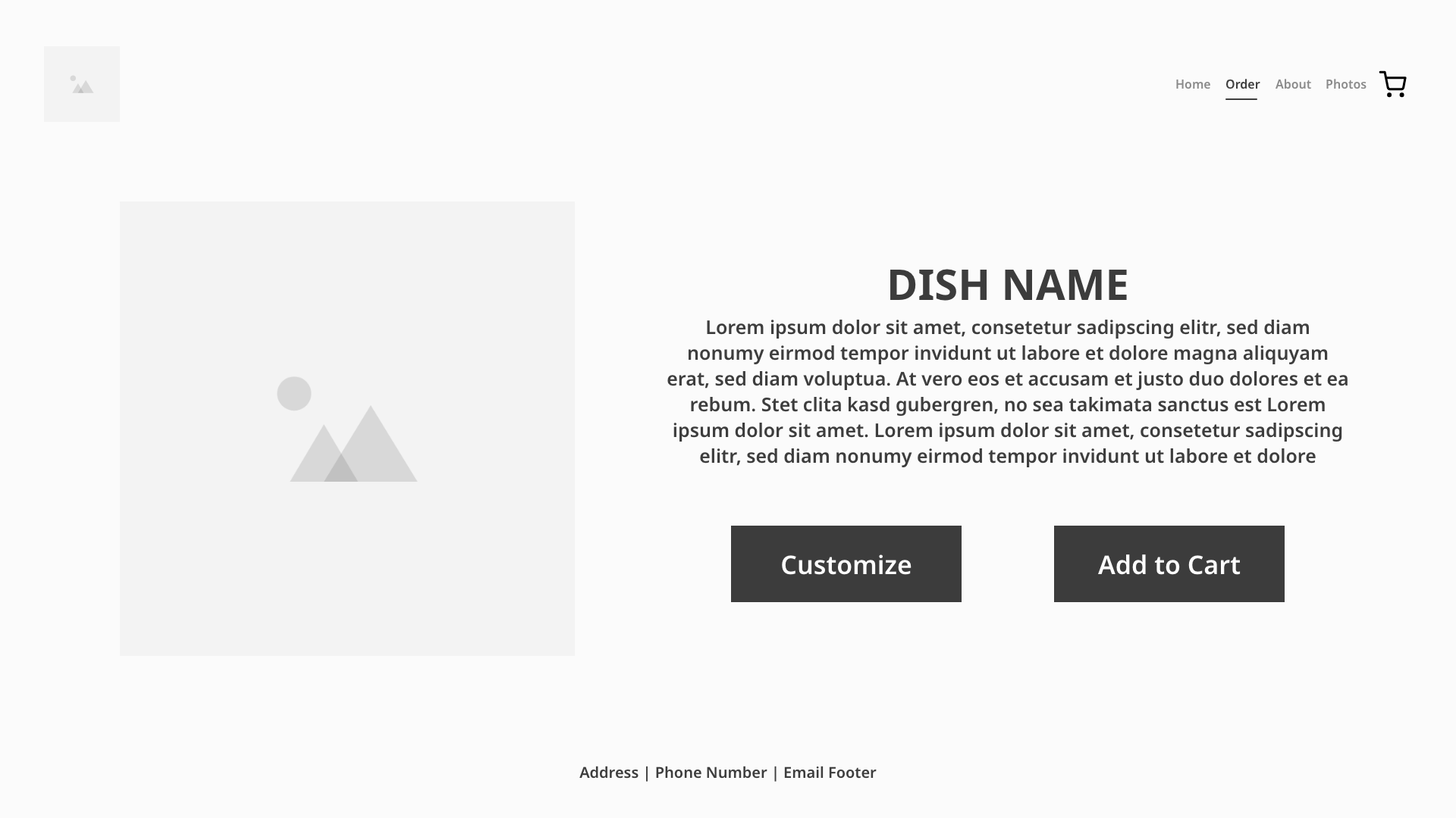
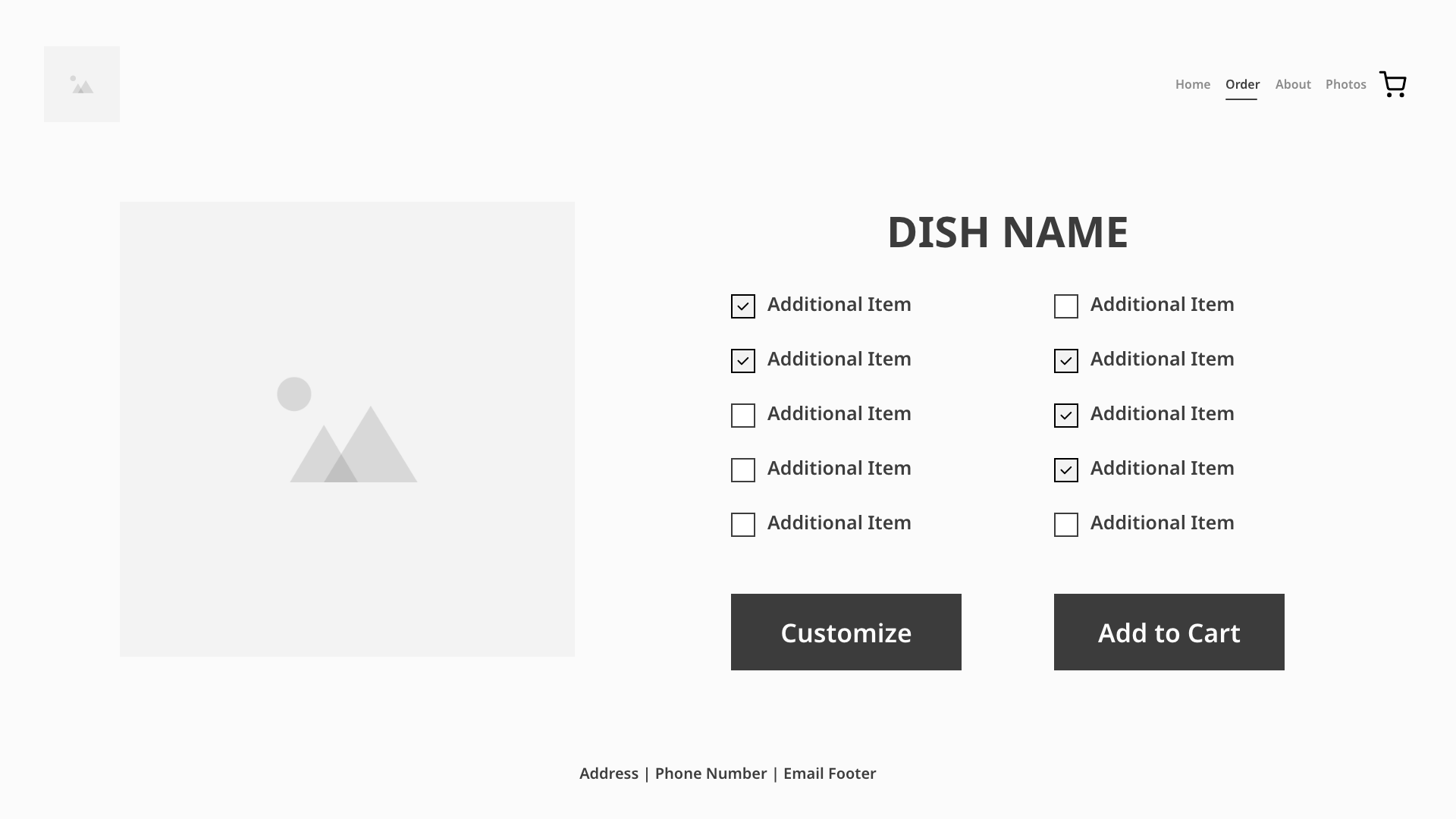
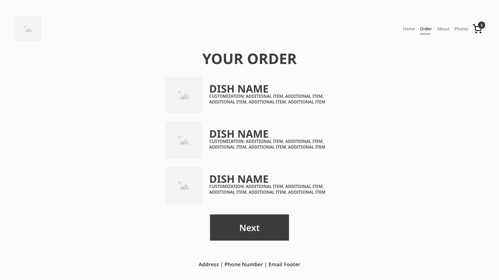
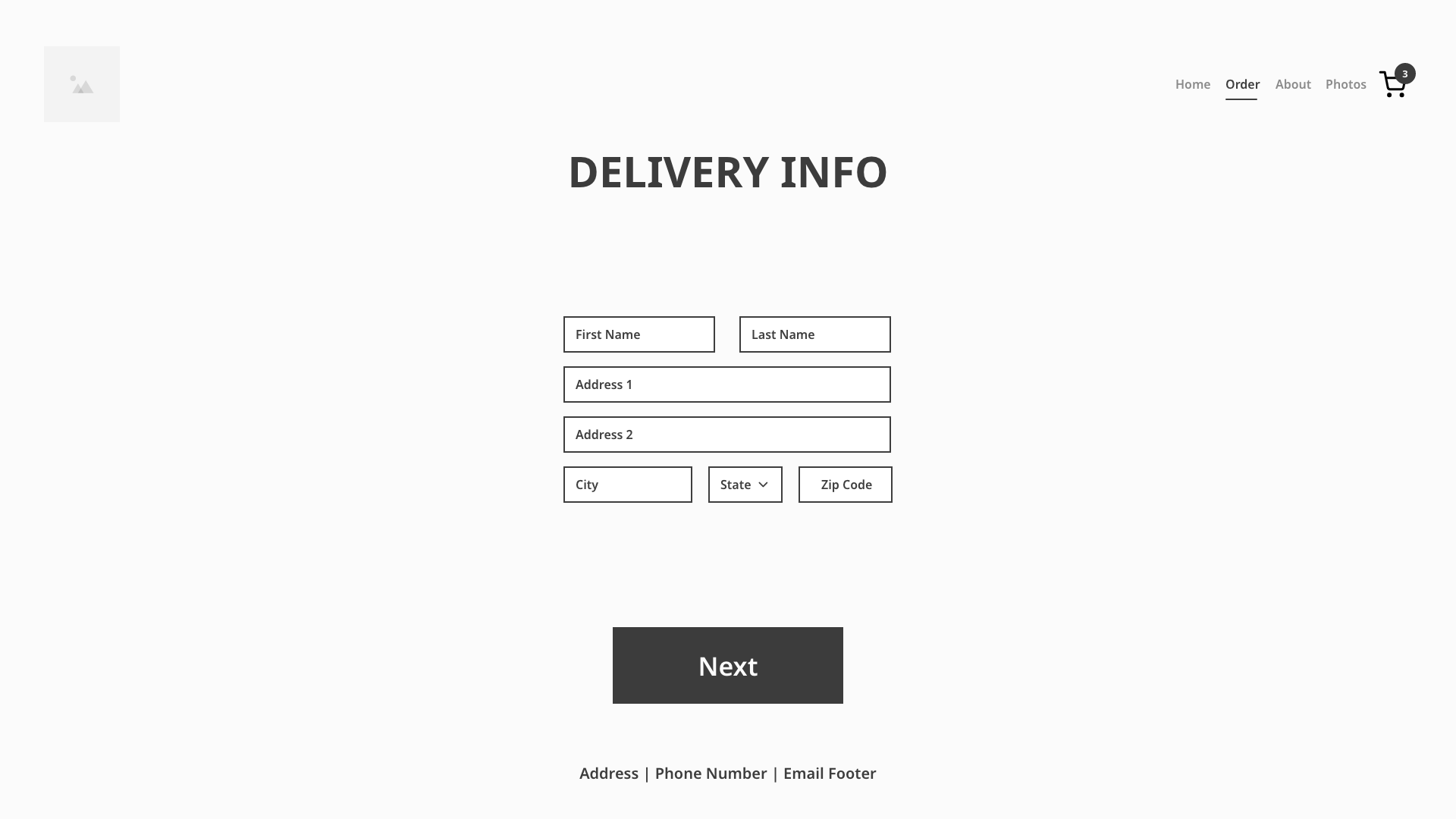
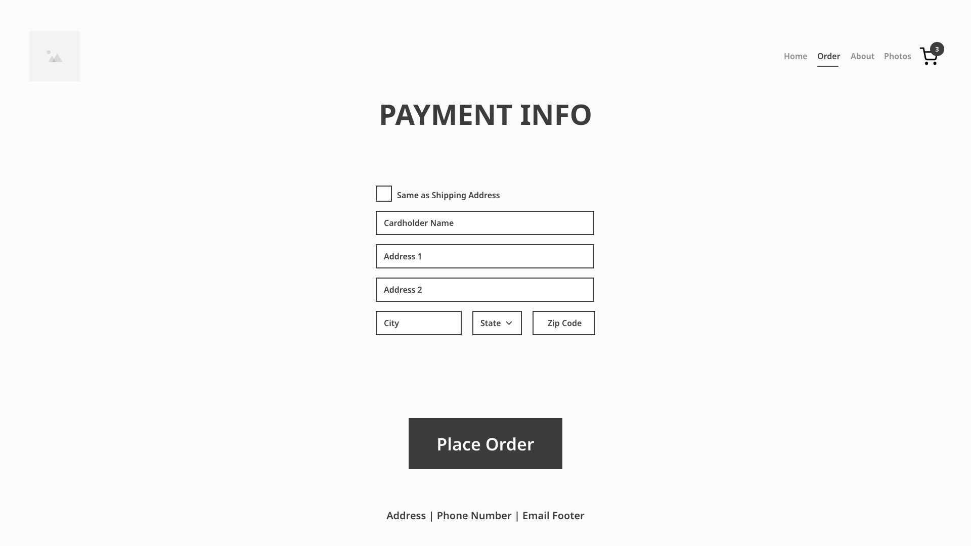
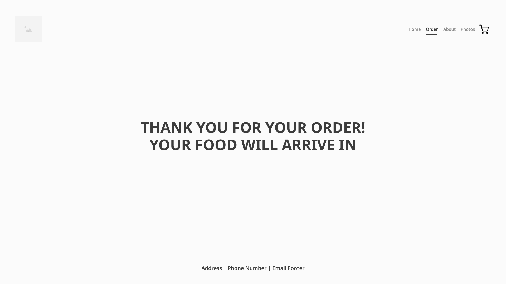
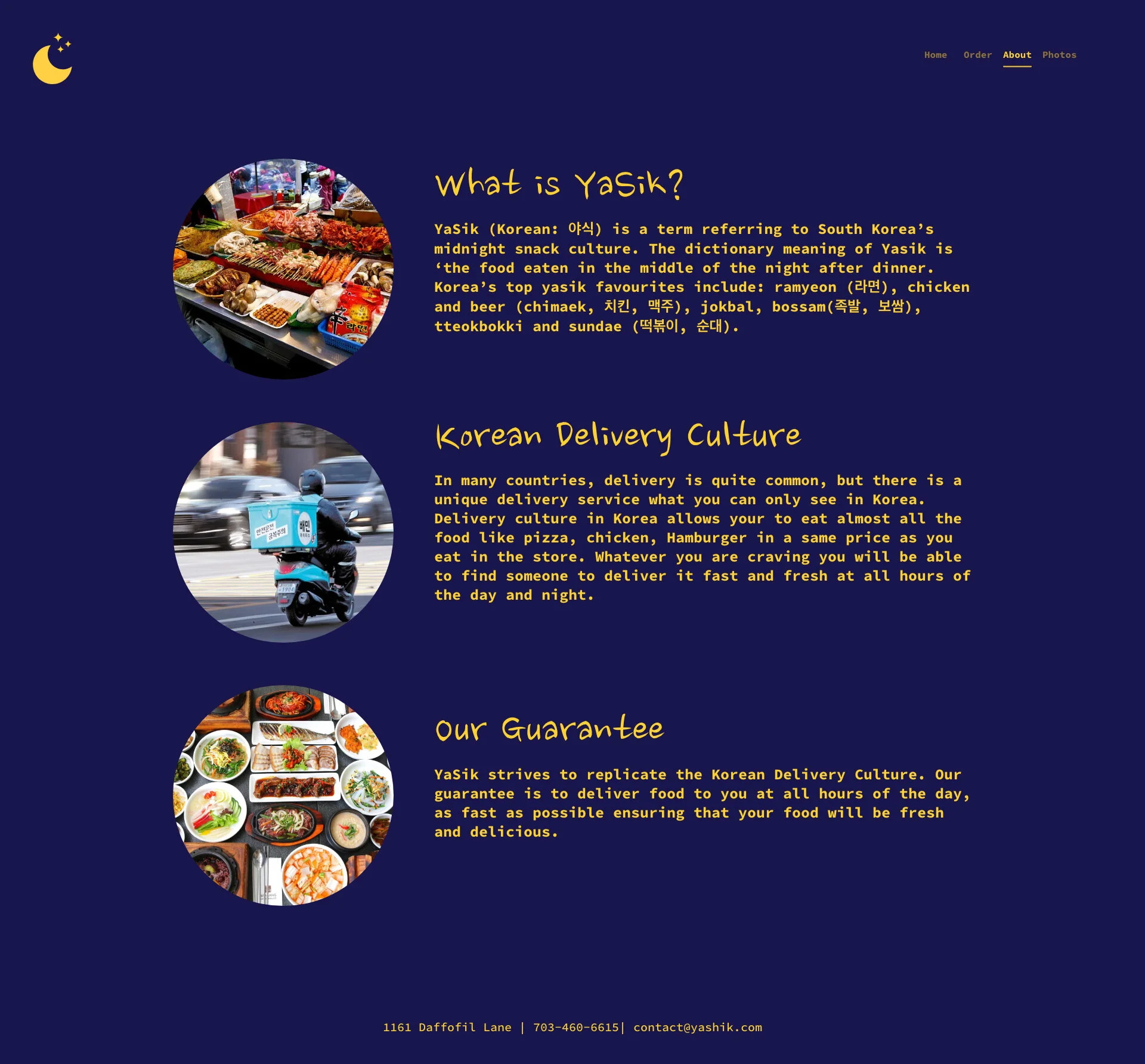
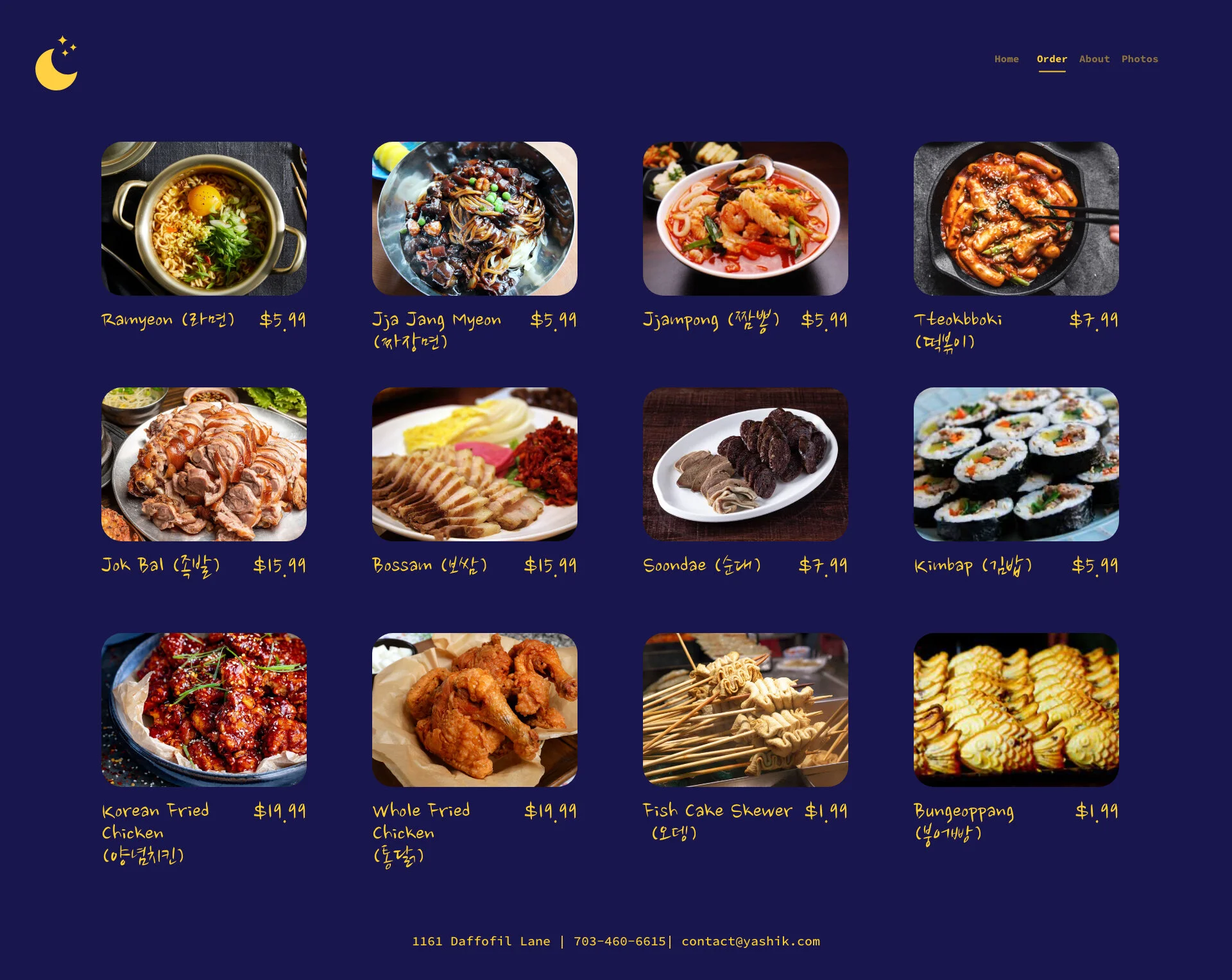
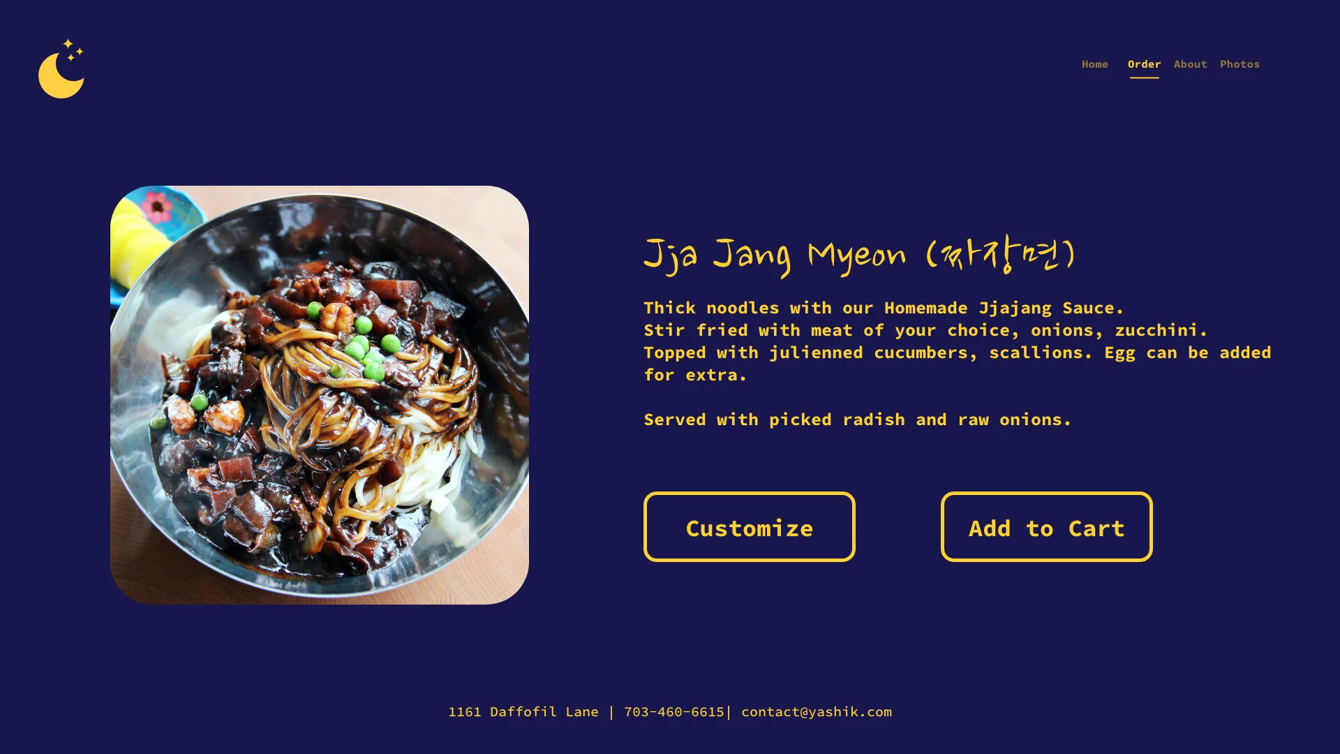
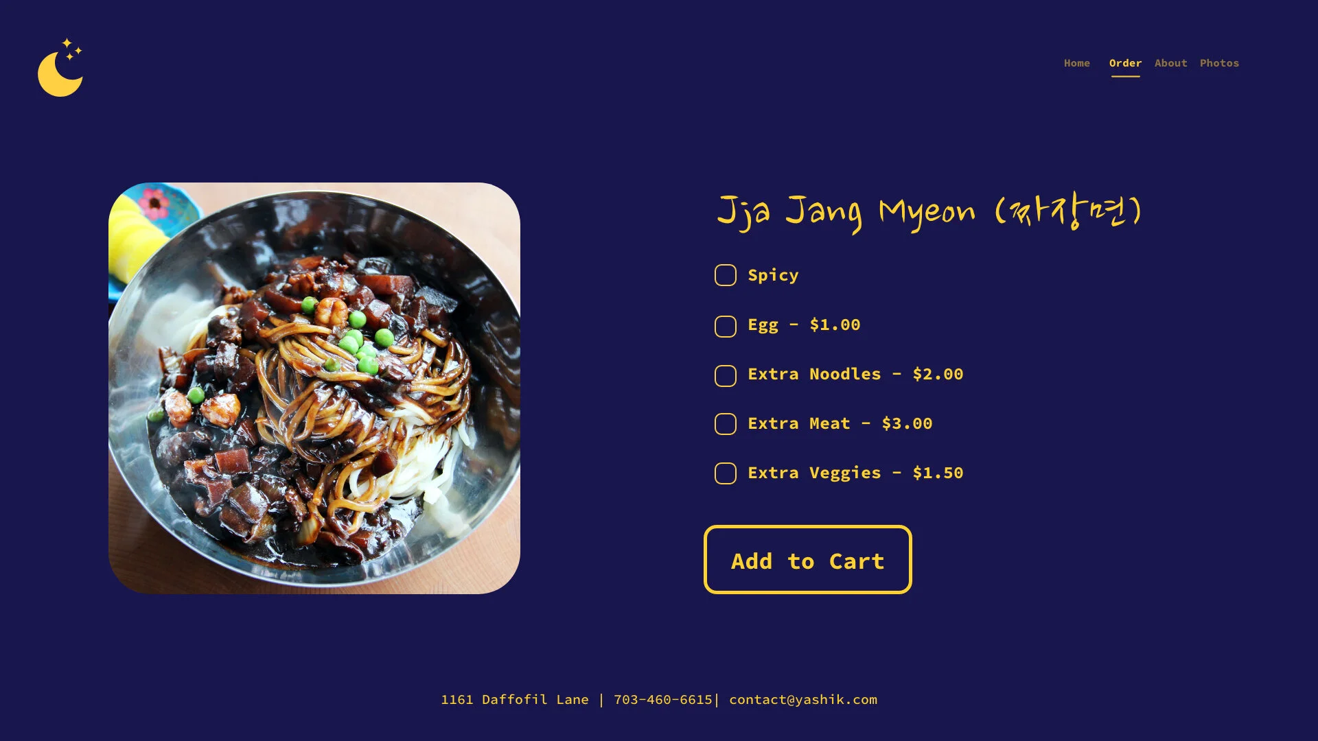
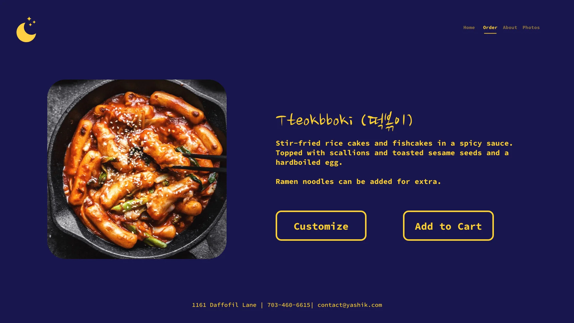
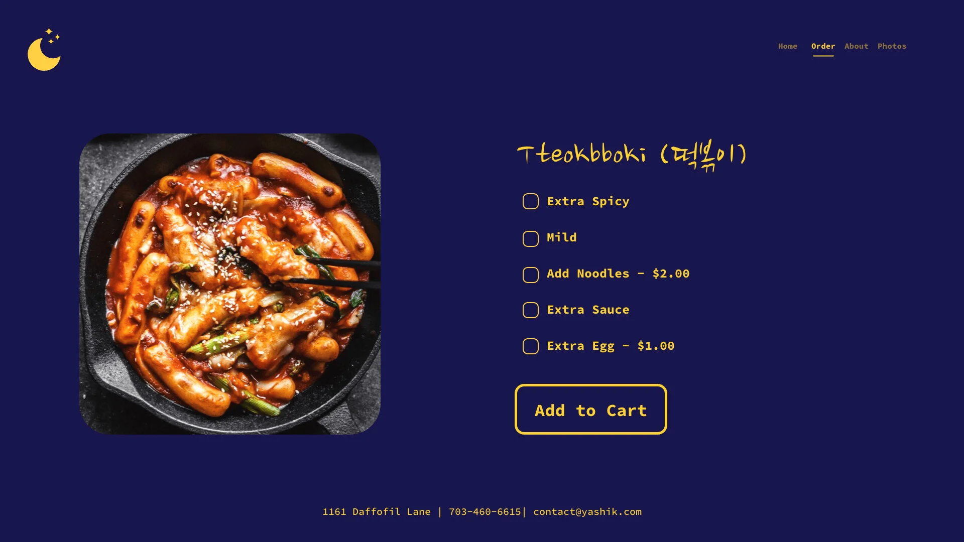
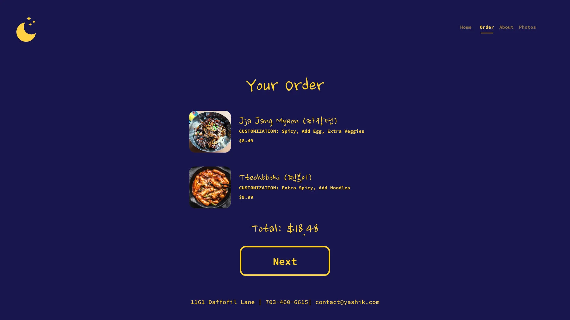
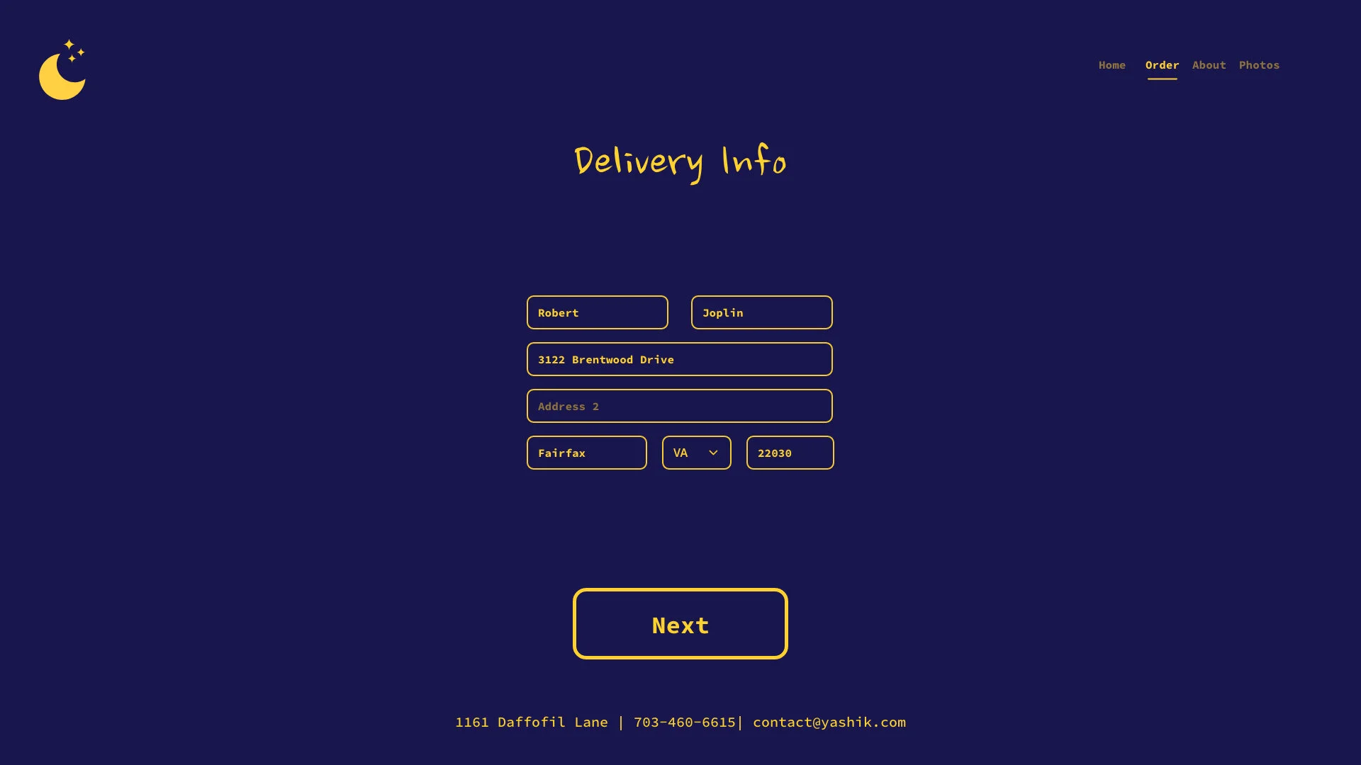
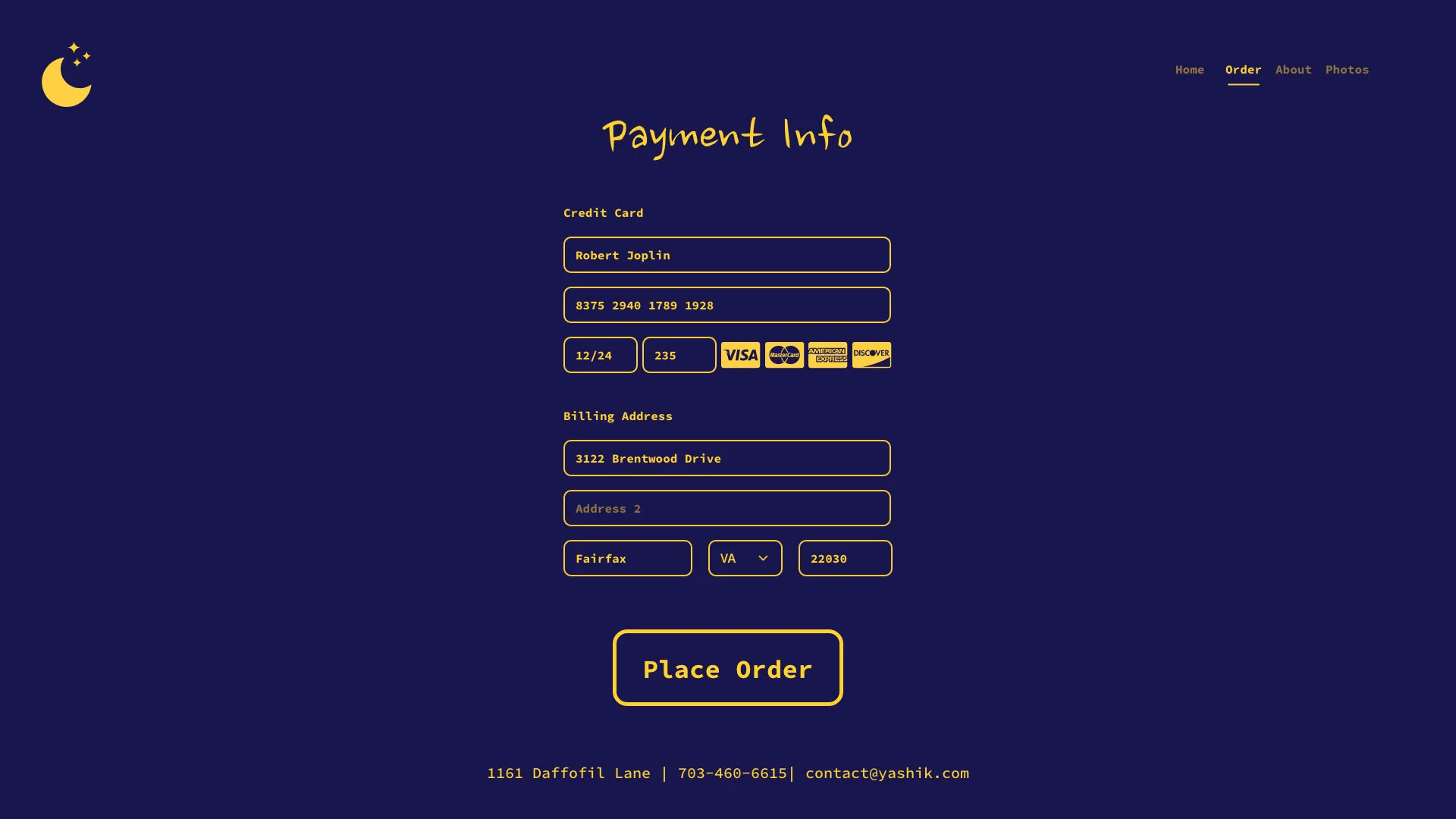
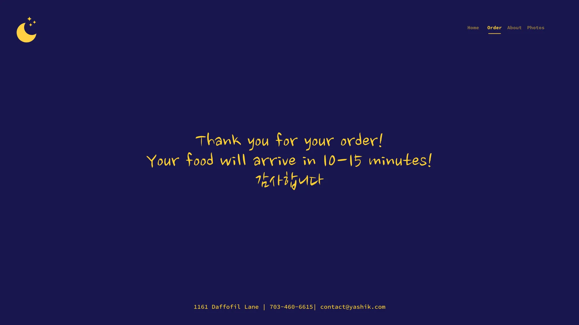
High Fidelity Frames
Once the Low Fidelity Wireframes and Mood Board were created I started to refine the Wireframes into a High Fidelity Version with images, text, colors and animations included.
Final Thoughts
Throughout the entirety of the process I felt that I had done a good job of creating and maintaining the look that I had set out to create in my planning process. Being a Korean American individual myself, I thought that I had a good grasp of what the overall look and feel for the site should have been. With feedback from testers on both visual and functional aspects of the site I felt that I had created a design that worked in both ways. One of my favorite aspects of the site is the colors that I ended up selecting. The midnight blue and bright yellow worked well together and, I believe, help amplify the nightlife aesthetic that I had planned for. Overall I believe that the the flow of the website was easy to understand and use and so I am pleased with how the project turned out.